Soheil Yousefi Frontend · Design engineer
CASE / 04

Atelier Casa

An architecture practice site paced like a printed monograph.

Role
Frontend architecture · UI
Year
2026
Stack
Astro · React · TS
Status
Self-directed showcase
FIG 00 · ATELIER CASA — COVER
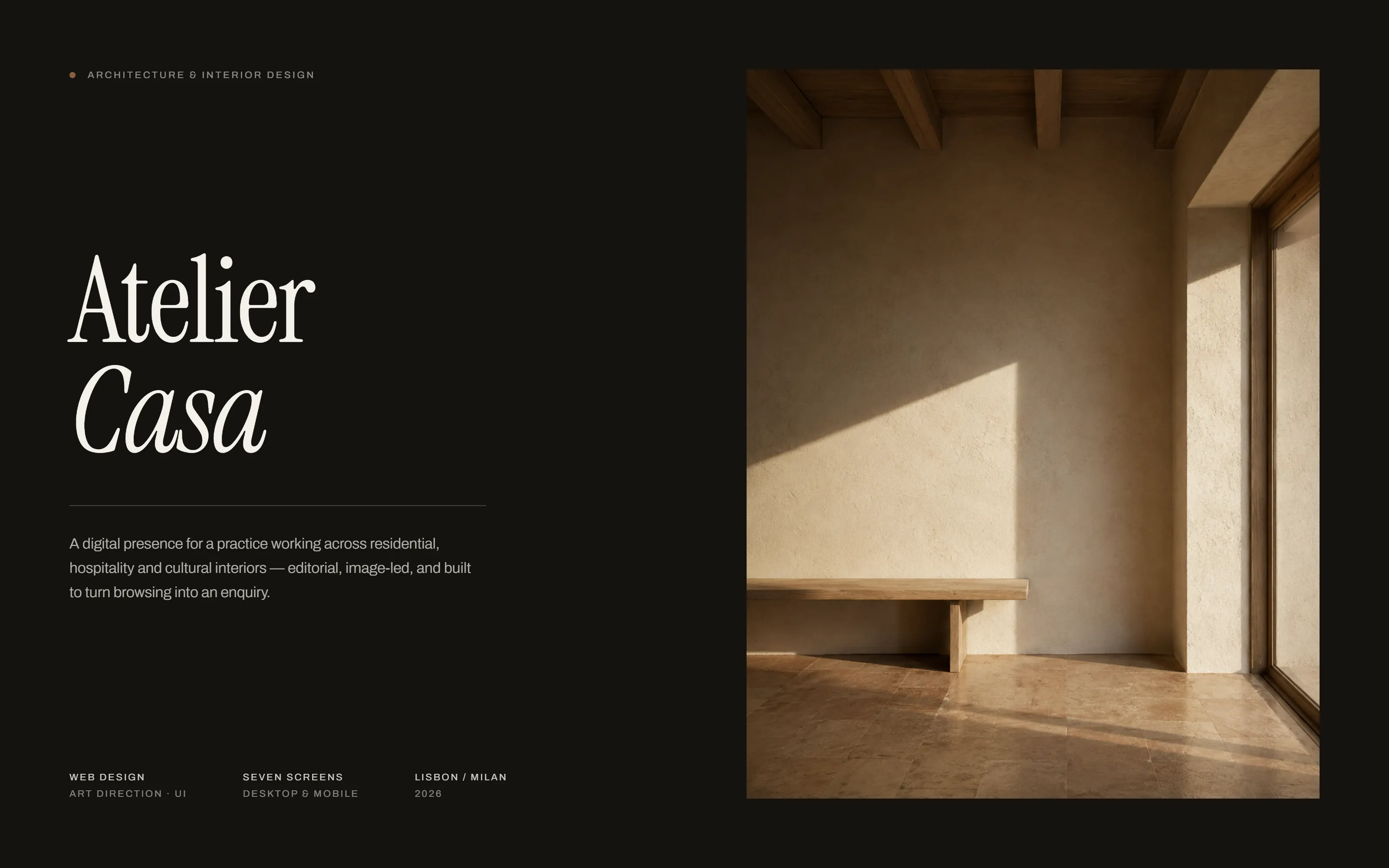
Atelier Casa cover: the studio wordmark and a one-paragraph project description on a dark ground, beside a photograph of a bench against a sunlit plaster wall
A practice that sells on restraint needs a site that shows restraint. The type system carries the voice; the photography carries the argument.
01 — PACING

A site paced like a monograph

An architecture practice publishes rather than markets. So the pacing is borrowed from a printed monograph: a full-bleed opening image, a quiet index, and a long single-column read per project with the specification set as marginalia rather than as a table someone has to parse.

That means the interface has almost no chrome. Navigation stays a single mono row, the only persistent action is booking a consultation, and everything else is photography and type.
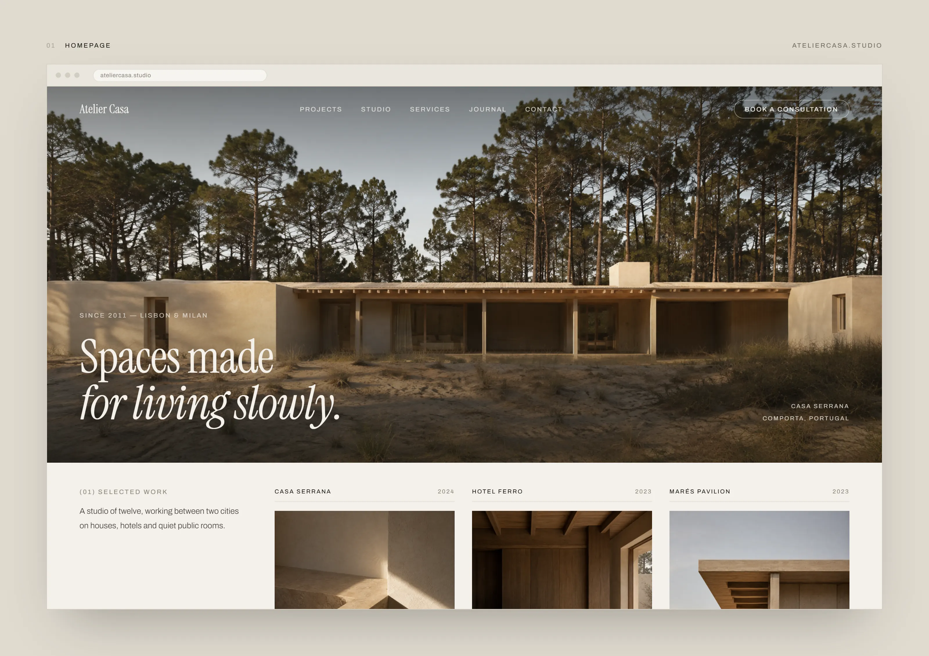
Atelier Casa homepage: a full-width photograph of a low plaster house in a pine clearing under an italic serif claim, above a selected-work row listing three projects with year and image
FIG 01 · HOMEPAGE — one image, one claim, and the work immediately beneath it.
02 — INDEX

An index that lets the images breathe
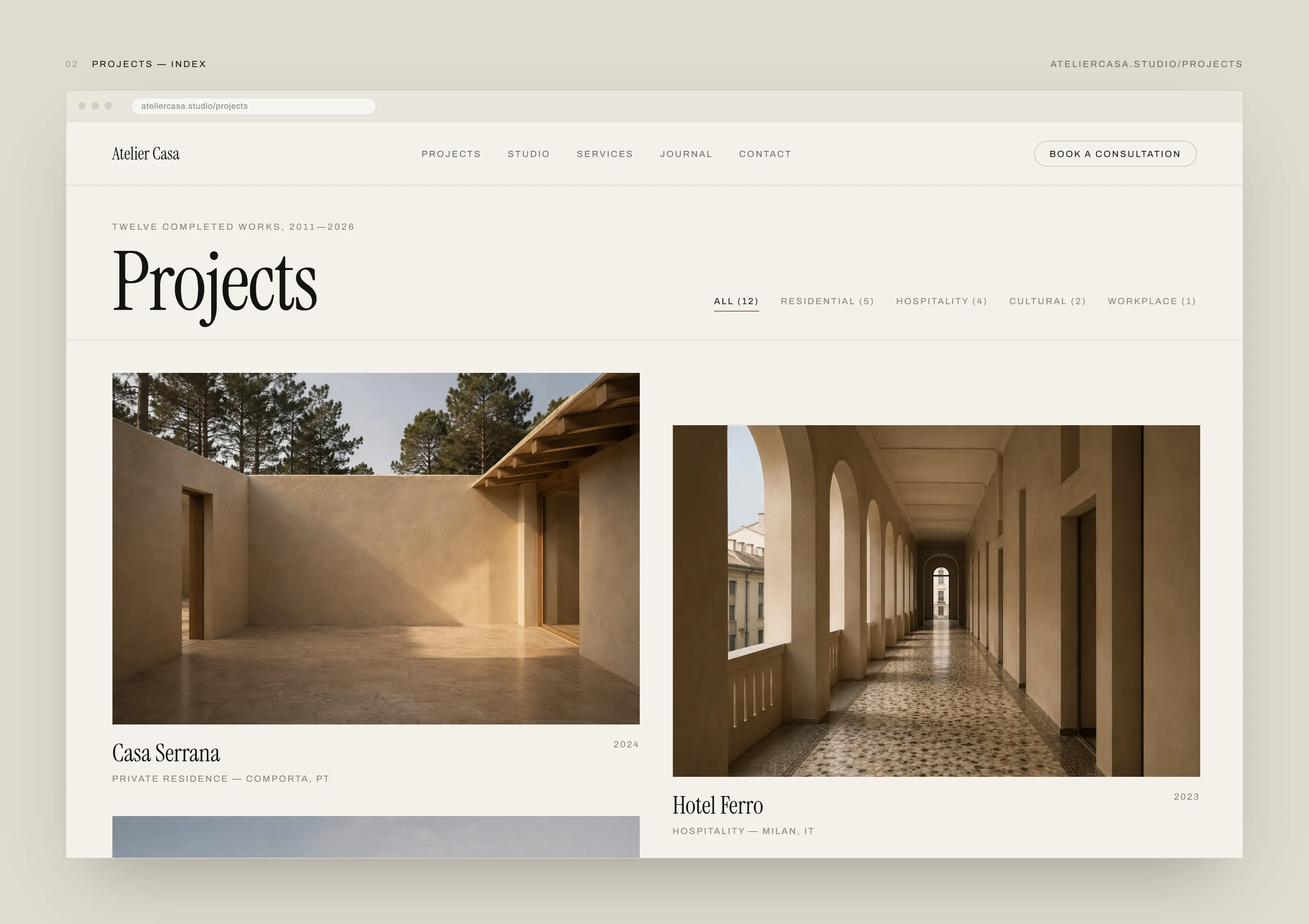
Atelier Casa projects index: a filter row for all, residential, hospitality, cultural and workplace with counts, above a two-column staggered grid of project photographs captioned with name, type, location and year
EVIDENCE · 01

Filter counts are rendered with the labels. A category that would return nothing is visible as empty before it is pressed.

FIG 02 · CASA SERRANA — PROJECT MONOGRAPH
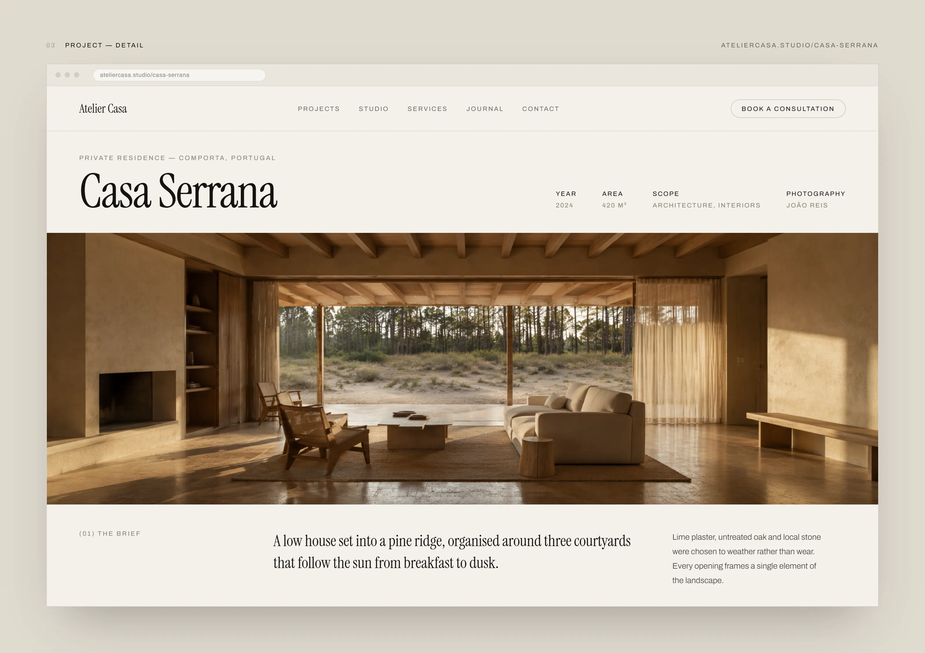
Atelier Casa project page: the project title with year, area, scope and photography credit set as a specification row, above a full-width interior photograph and a three-column brief
The specification sits in the header as a single mono row — year, area, scope, photographer — so it is available without competing with the image below it.
03 — DOCUMENT PAGES

The pages that are not photography

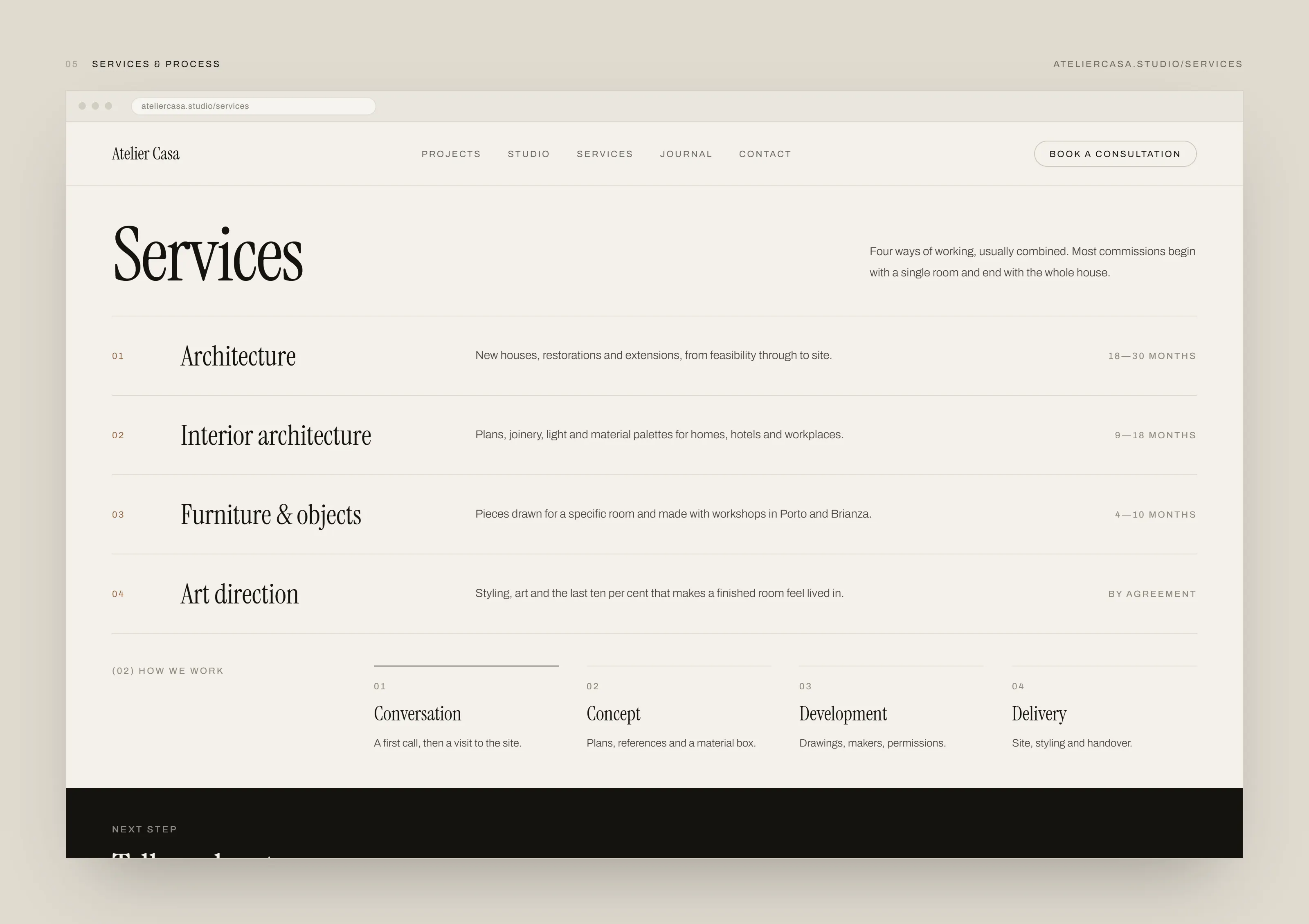
A studio page and a services page have to hold text without breaking the pacing. Both use the same measure and the same rules as the project pages, so the site reads as one document rather than a gallery with an about page bolted on.
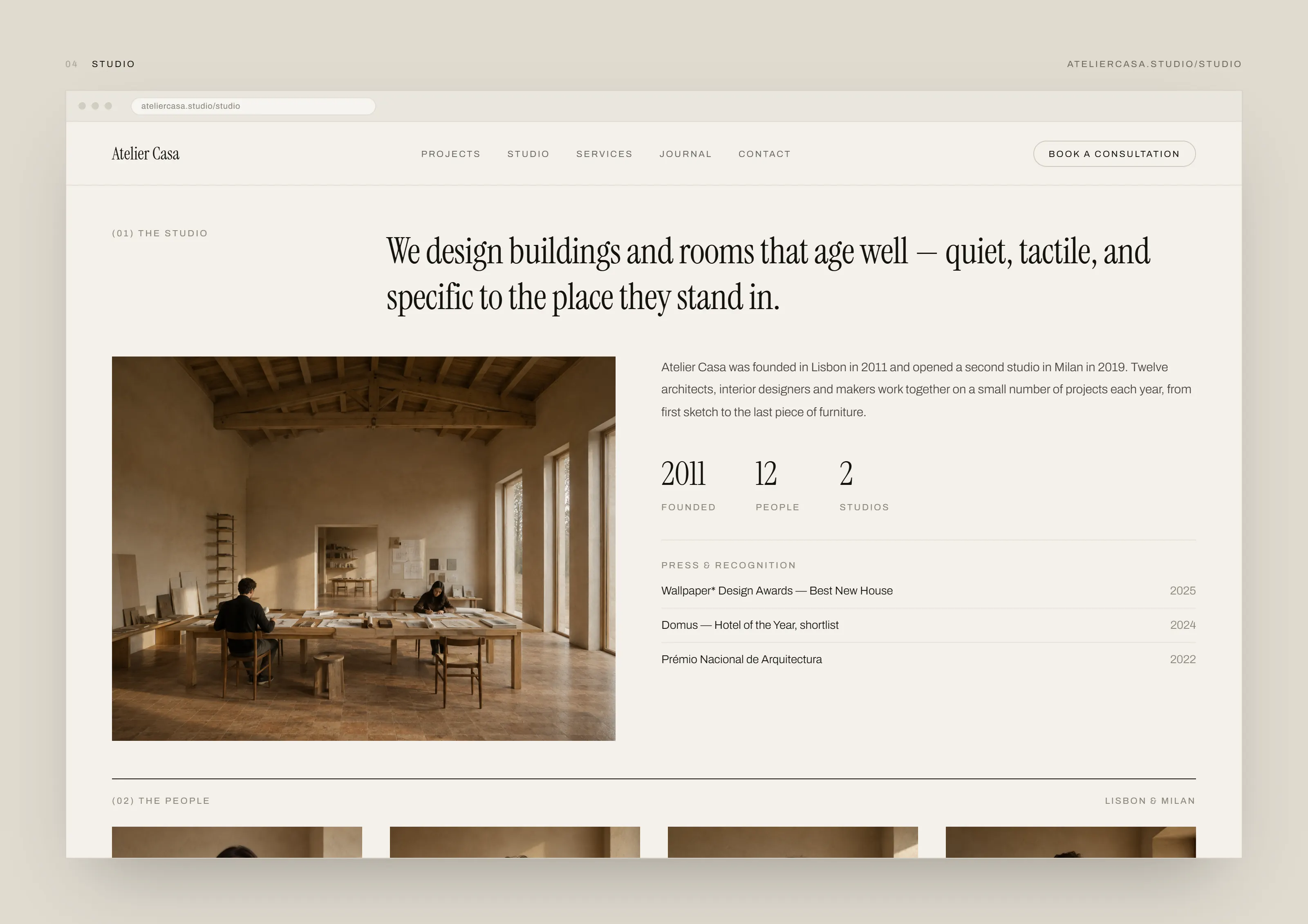
Atelier Casa studio page: a serif statement above a photograph of two people working at a long table, beside a paragraph about the practice, three serif figures for founding year, headcount and number of studios, and a dated press list
FIG 03 · STUDIO
Atelier Casa services page: four numbered services in a ruled list, each with a one-line description and a typical duration on the right, above a four-step how-we-work row
FIG 04 · SERVICES
04 — CONVERSION

One action, and it is a conversation

The studio’s only call to action is a thirty-minute consultation, so the contact page puts the enquiry form and the calendar side by side rather than making someone choose between them. The direct studio address is offered beside the submit button, because some people would simply rather write an email.
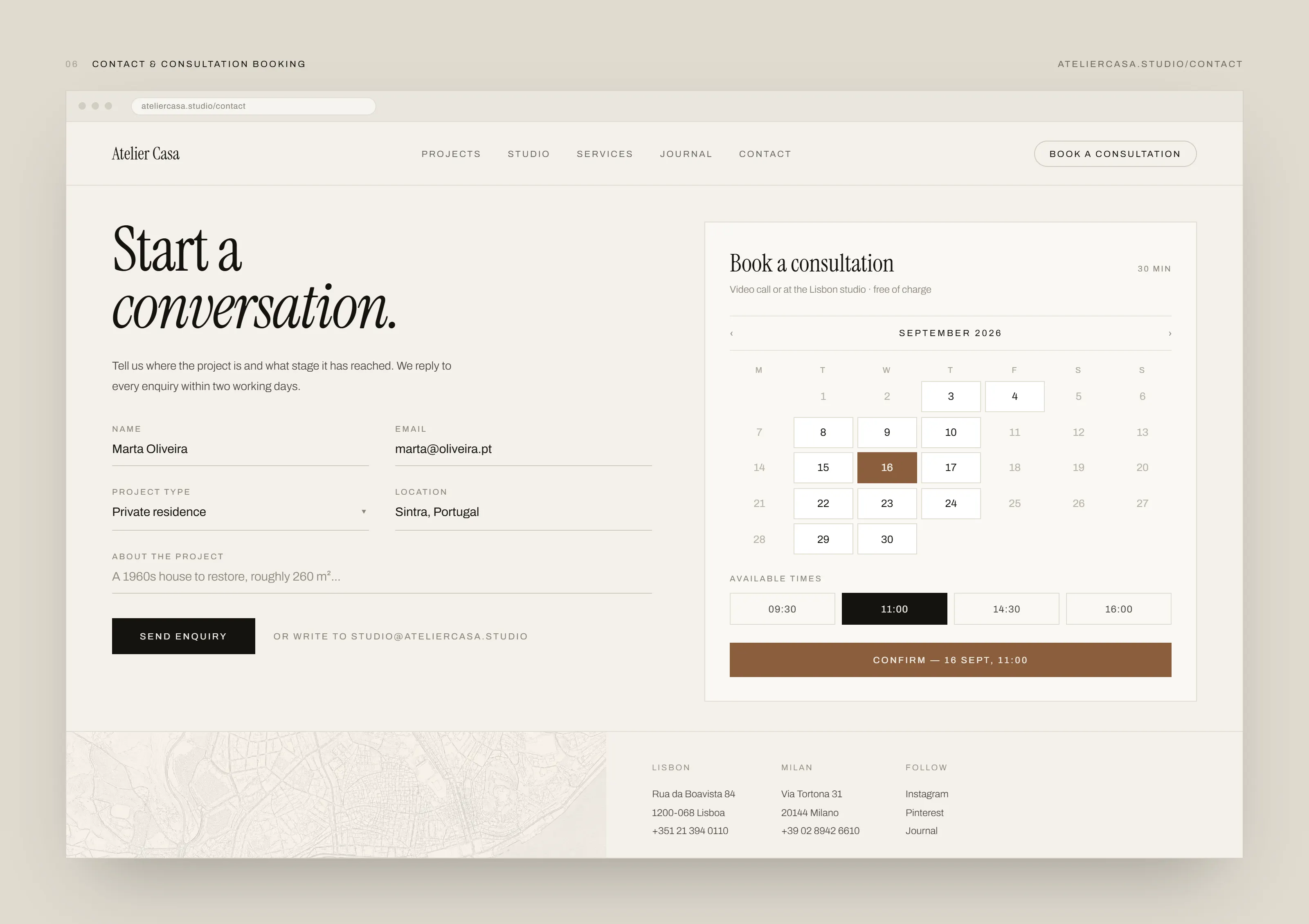
Atelier Casa contact page: an enquiry form for name, email, project type, location and project description on the left, beside a consultation booking panel with a September calendar, four available times and a confirm action
FIG 05 · CONTACT & BOOKING — the form and the calendar are one screen. Fields show seeded prototype data.
05 — RESPONSIVE

The same document, narrower

On a phone the monograph pacing survives because it was never held together by a grid — it is held together by the measure and the rules. The nav collapses to a single MENU control, the project index becomes one column, and the booking calendar keeps full-size tap targets.
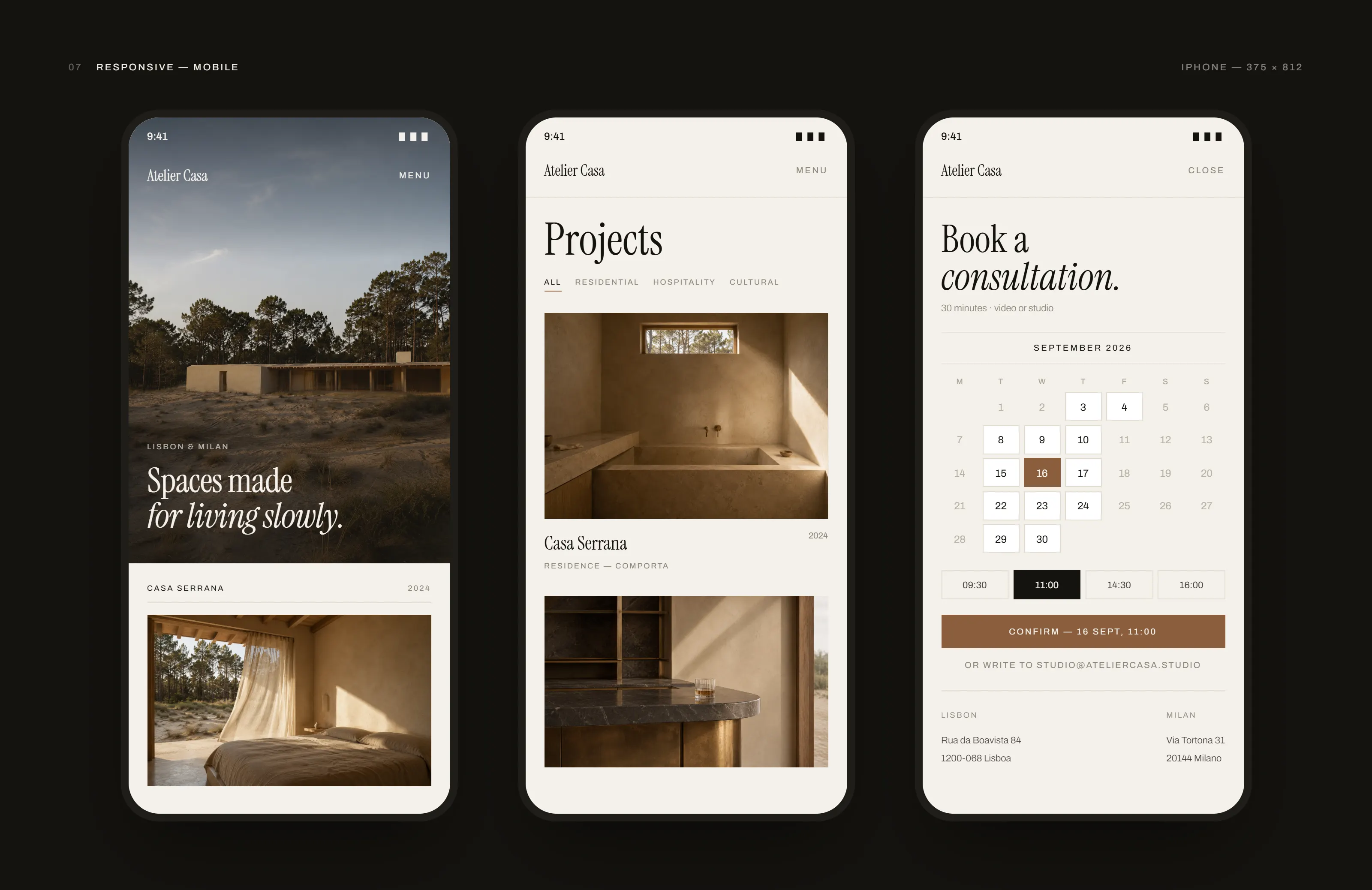
Atelier Casa mobile views: three phone screens showing the homepage with a collapsed menu control, the single-column projects index with its filter row, and the consultation booking calendar with available times
FIG 06 · RESPONSIVE — the only figure on this site that is itself a mobile view, so it renders at its own proportions rather than inside a desktop frame.
WHAT I'D DO NEXT
A journal, which the navigation already promises and the layout does not yet cover.
Project pages assume a consistent image count; a small project with three photographs needs a different sequence to a large one.
The booking panel is the one place this site needs a backend, and it is the piece most likely to change shape once a real calendar is behind it.
PROOF
Live prototype URL REQUIRED
Component source REPO REQUIRED

A proof link renders only once its destination exists.